Making a modal dialog using yieldable named blocks

15 October 2020

Have you ever wished you could pass more than one block when invoking components using the angle-bracket syntax? I certainly have.

There are ways around it but all the ones I tried had shortcomings. So I was glad to see the Yieldable Named Blocks RFC accepted and was even happier to learn that a polyfill add-on, ember-named-blocks-polyfill already implements the RFC.

What are named blocks?

So what are named blocks? With angle-bracket invocation, components can yield from their templates which invokes the passed block.

Imagine we have the following modal dialog component:

 1{{!-- modal-dialog.hbs --}}
 2<div class="modal-dialog">
 3  <div class="header">
 4    <h3>{{@title}}</h3>
 5  </div>
 6  <div class="body">
 7    {{yield}}
 8  </div>
 9  <div class="footer">
10    {{@footer}}
11  </div>
12</div>

Let's invoke it as follows:

1<ModalDialog
2  @title="Are you sure?"
3  @footer="This will irrevocably delete your account."
4>
5  <button class="cancel" type="button">Oh, no, I misclicked</button>
6  <button class="confirm" type="button">Yes, I'm sure</button>
7</ModalDialog>

That gives us the following rendered content:

 1<div class="modal-dialog">
 2  <div class="header">
 3    <h3>Are you sure?</h3>
 4  </div>
 5  <div class="body">
 6    <button class="cancel" type="button">Oh, no, I misclicked</button>
 7    <button class="confirm" type="button">Yes, I'm sure</button>
 8  </div>
 9  <div class="footer">
10    This will irrevocably delete your account.
11  </div>
12</div>

So far so good. However, what if we want to also customize the header or footer, beyond passing in simple strings for those values? I might need to have an h2 in the header or have a fancy footer, with non-trivial markup.

One solution is to pass in (contextual) components and check in the component's template if they are. The main drawback of this approach is that you have to create components for such simple tasks (like passing in an h2) which adds clutter to the project.

This is where named blocks can provide a cleaner solution.

Using named blocks

Since I used a modal dialog example in a previous blog post, let's practice learning by doing and convert it to use named blocks.

We start by creating a modal dialog component:

1$ ember g component modal-dialog

The modal dialog currently looks like the following:

 1{{!-- songs.hbs --}}
 2<div class="fixed bottom-0 inset-x-0 px-4 pb-4 sm:inset-0 sm:flex sm:items-center sm:justify-center">
 3  {{!-- Overlay --}}
 4  <div
 5    class="fixed inset-0 transition-opacity"
 6    role="button"
 7    {{on "click" (set this.songToDelete null)}}
 8  >
 9    <div class="absolute inset-0 bg-gray-500 opacity-75"></div>
10  </div>
11
12  {{!-- Panel --}}
13  <div class="bg-white rounded-lg px-4 pt-5 pb-4 overflow-hidden shadow-xl transform sm:max-w-lg sm:w-full sm:p-6" role="dialog" aria-modal="true" aria-labelledby="modal-headline">
14    <div class="sm:flex sm:items-start">
15      <div class="mx-auto flex-shrink-0 flex items-center justify-center h-12 w-12 rounded-full bg-red-100 sm:mx-0 sm:h-10 sm:w-10">
16        <svg class="h-6 w-6 text-red-600" fill="none" viewBox="0 0 24 24" stroke="currentColor">
17          <path stroke-linecap="round" stroke-linejoin="round" stroke-width="2" d="M12 9v2m0 4h.01m-6.938 4h13.856c1.54 0 2.502-1.667 1.732-3L13.732 4c-.77-1.333-2.694-1.333-3.464 0L3.34 16c-.77 1.333.192 3 1.732 3z"/>
18        </svg>
19      </div>
20      <div class="mt-3 text-center sm:mt-0 sm:ml-4 sm:text-left">
21        <h3 class="text-lg leading-6 font-medium text-gray-900">
22          Delete song
23        </h3>
24        <div class="mt-2">
25          <p class="text-sm leading-5 text-gray-500">
26            Are you sure you want to delete {{this.songToDelete.title}}?
27          </p>
28        </div>
29      </div>
30    </div>
31    <div class="mt-5 sm:mt-4 sm:flex sm:flex-row-reverse">
32      <span class="flex w-full rounded-md shadow-sm sm:ml-3 sm:w-auto">
33        <button
34          type="button"
35          class="inline-flex justify-center w-full rounded-md border border-transparent px-4 py-2 bg-red-600 leading-6 font-medium text-white shadow-sm hover:bg-red-500"
36          {{on "click" this.deleteSong}}
37        >
38          Delete
39        </button>
40      </span>
41      <span class="mt-3 flex w-full rounded-md shadow-sm sm:mt-0 sm:w-auto">
42        <button
43          type="button"
44          class="inline-flex justify-center w-full rounded-md border border-gray-300 px-4 py-2 bg-white leading-6 font-medium text-gray-700 shadow-sm hover:text-gray-500"
45          {{on "click" (set this.songToDelete null)}}
46        >
47          Cancel
48        </button>
49      </span>
50    </div>
51  </div>
52</div>

Since we didn't write this to be a general solution for modal dialogs, there are use-case specific parts which need to be made customizable. This includes the title of the dialog, the confirm and the cancel actions, at least. A higher-level way to think about this is that we want to allow overwriting parts of the component itself: the header, the body, and the buttons. Let's bring over the template bits, keeping this in mind:

 1{{!-- modal-dialog.hbs --}}
 2<div class="fixed bottom-0 inset-x-0 px-4 pb-4 sm:inset-0 sm:flex sm:items-center sm:justify-center">
 3  {{!-- Overlay --}}
 4  {{#let (if @onOverlayClick @onOverlayClick (noop)) as |overlayClick|}}
 5    <div
 6      class="fixed inset-0 transition-opacity"
 7      role="button"
 8      data-test-rr="modal-dialog-overlay"
 9      {{on "click" overlayClick}}
10    >
11      <div class="absolute inset-0 bg-gray-500 opacity-75"></div>
12    </div>
13  {{/let}}
14
15  {{!-- Panel --}}
16  <div class="bg-white rounded-lg px-4 pt-5 pb-4 overflow-hidden shadow-xl transform sm:max-w-lg sm:w-full sm:p-6" role="dialog" aria-modal="true" aria-labelledby="modal-headline">
17    <div class="sm:flex sm:items-start">
18      <div class="mx-auto flex-shrink-0 flex items-center justify-center h-12 w-12 rounded-full bg-red-100 sm:mx-0 sm:h-10 sm:w-10">
19        <svg class="h-6 w-6 text-red-600" fill="none" viewBox="0 0 24 24" stroke="currentColor">
20          <path stroke-linecap="round" stroke-linejoin="round" stroke-width="2" d="M12 9v2m0 4h.01m-6.938 4h13.856c1.54 0 2.502-1.667 1.732-3L13.732 4c-.77-1.333-2.694-1.333-3.464 0L3.34 16c-.77 1.333.192 3 1.732 3z"/>
21        </svg>
22      </div>
23      <div class="mt-3 text-center sm:mt-0 sm:ml-4 sm:text-left">
24        {{yield to="header"}}
25        <div class="mt-2">
26          {{yield to="body"}}
27        </div>
28      </div>
29    </div>
30    {{#if (has-block "buttons-panel")}}
31      {{yield to="buttons-panel"}}
32    {{else}}
33      <div class="mt-5 sm:mt-4 sm:flex sm:flex-row-reverse">
34        {{#if @onConfirm}}
35          <span class="flex w-full rounded-md shadow-sm sm:ml-3 sm:w-auto">
36            <button
37              type="button"
38              class="inline-flex justify-center w-full rounded-md border border-transparent px-4 py-2 bg-red-600 leading-6 font-medium text-white shadow-sm hover:bg-red-500"
39              data-test-rr="modal-dialog-confirm-button"
40              {{on "click" @onConfirm}}
41            >
42              {{@buttonText}}
43            </button>
44          </span>
45        {{/if}}
46        {{#if @onCancel}}
47          <span class="mt-3 flex w-full rounded-md shadow-sm sm:mt-0 sm:w-auto">
48            <button
49              type="button"
50              class="inline-flex justify-center w-full rounded-md border border-gray-300 px-4 py-2 bg-white leading-6 font-medium text-gray-700 shadow-sm hover:text-gray-500"
51              data-test-rr="modal-dialog-cancel-button"
52              {{on "click" @onCancel}}
53            >
54              Cancel
55            </button>
56          </span>
57        {{/if}}
58      </div>
59    {{/if}}
60  </div>
61</div>

There's a lot to unpack, so let's go one by one. The great thing about modern Ember is that we know at a glance which properties are passed when invoking the component since those use the @ prefix: the named arguments of the component.

Let's start with the overlay:

 1{{#let (if @onOverlayClick @onOverlayClick (noop)) as |overlayClick|}}
 2  <div
 3    class="fixed inset-0 transition-opacity"
 4    role="button"
 5    data-test-rr="modal-dialog-overlay"
 6    {{on "click" overlayClick}}
 7  >
 8    <div class="absolute inset-0 bg-gray-500 opacity-75"></div>
 9  </div>
10{{/let}}

@onOverlayClick is the action that needs to be called when the overlay is clicked. To keep the template code more readable, we provide a default action, called noop. It doesn't do anything, but because we can't conditionally add an event handler with on, we'd have to duplicate the whole div otherwise: once with the on and once without it.

The noop is just a helper with the following content:

1// app/helpers/noop.js
2import { helper } from '@ember/component/helper';
3
4export default helper(function noop() {
5  return () => {};
6});

Let's look at the next snippet from the template:

1<div class="mt-3 text-center sm:mt-0 sm:ml-4 sm:text-left">
2  {{yield to="header"}}
3  <div class="mt-2">
4    {{yield to="body"}}
5  </div>
6</div>

The {{yield to="header"}} and {{yield to="body"}} are the slots which can be filled in when calling the component (we'll soon see how).

The next template block shows another feature of named blocks:

1{{#if (has-block "buttons-panel")}}
2  {{yield to="buttons-panel"}}
3{{else}}
4  {{!-- (...) --}}
5{{/if}}

With has-block, we can check whether a block was passed for a specific name which enables us to provide a default implementation for the block.

In this case, the else branch has a confirm and cancel button which can be customized by passing @buttonText, @onConfirm, and @onCancel.

We know now that when calling the component can pass in a header and body block for the header and body content respectively. We can also pass in a buttons-panel block. If we don't, two buttons will be rendered by default and we need to provide @buttonText, @onConfirm, and @onCancel to make them work.

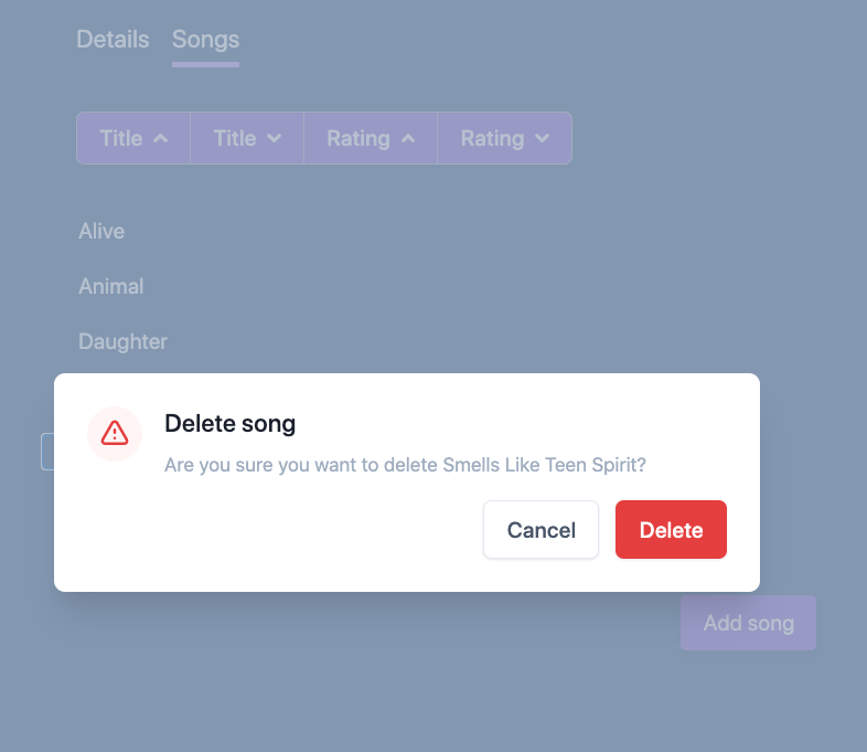
Our ModalDialog is all set: let's start using it. Going back to the songs template, let's replace the huge template chunk we had there with the following:

 1{{!-- songs.hbs --}}
 2{{#in-element this.modalContainer}}
 3  {{#if this.songToDelete}}
 4    {{#let (set this.songToDelete null) as |cancelDelete|}}
 5      <ModalDialog
 6        @buttonText="Delete"
 7        @onOverlayClick={{cancelDelete}}
 8        @onConfirm={{this.deleteSong}}
 9        @onCancel={{cancelDelete}}
10      >
11        <:header>
12          <h3 class="text-lg leading-6 font-medium text-gray-900">
13            Delete song
14          </h3>
15        </:header>
16        <:body>
17          <p class="text-sm leading-5 text-gray-500">
18            Are you sure you want to delete {{this.songToDelete.title}}?
19          </p>
20        </:body>
21      </ModalDialog>
22    {{/let}}
23  {{/if}}
24{{/in-element}}

The <:header> syntax is how you provide a named block: you write the name of the block after the leading :.

Fortunately, the flow of deleting a song still works after extracting the component.

Deleting a song – now via the ModalDialog component

What (else) can you do with named blocks?

We've seen one example of using named blocks, a modal dialog. Named blocks are useful anywhere where it makes sense to provide several "slots" that the user of the component can customize. This can include tables, layouts, or button panels.

Can you think of some examples where named blocks are great to use? Or in cases, when they are not? Other questions or comments? Let me know on the discussion forum for the post.

Share on Twitter