Using in-element in Ember.js
09 October 2020
The in-element helper has eluded me for a long time. I've seen it mentioned in forum discussions and RFC comments but since I didn't come across a situation where I needed it (or, it's possible I just didn't realize I could've used it) I didn't get familiar with it.
I decided to learn more about it by building something and sharing my knowledge with you.
What are we building?
Being the author of Rock and Roll with Ember Octane it's only natural that the feature I decided to build has to do with the app in the book.
In the app we develop in the book, you can create bands and songs, but you can't edit their names or delete them. So let's allow users to delete songs and make them confirm such a devastating operation.
Here's the rough, non-visual UI flow:
- When list item is hovered, it will display a trash can they can click on
- When the trash can is clicked, it brings up a dialog that asks the user to confirm the deletion
- If the user either clicks the cancel button on the dialog or clicks outside the dialog, it is closed (and the operation aborted)
- If the user clicks the confirm button, we go ahead with the deletion and then close the dialog
Let's start by adding the visuals for the trash can that appears on hover.
The hovering trash can
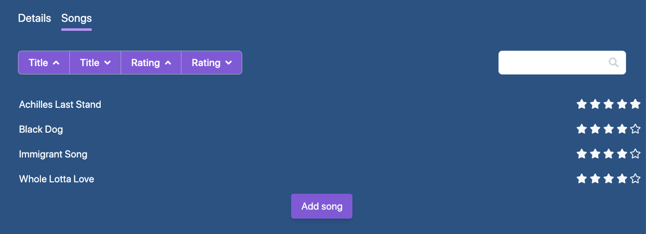
The app uses TailwindCSS and has the following snippet to show the list of songs:
As a first step, we'll add a background hover for each song item in the list:
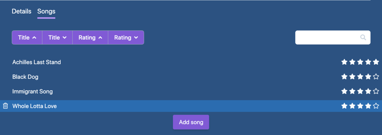
We should show a trash can icon on hover, clicking on which will be taken as wanting to delete the song. What we want here is a "group hover". The trash can should be shown not only if its direct parent is hovered but if the song item itself (the li tag) is.
Tailwind supports this functionality. The group itself should have the group class and the element that should have the hover state needs the group-hover class:
The songToDelete property holds the song that the user is about to delete but hasn't confirmed yet.
The set helper is provided by the ember-set-helper add-on. It is similar to mut but it's a lot cleaner and is my preferred way of setting properties in template-land. You can read more about this topic in pzuraq's "On {{mut}} and 2-Way-Binding".
For the group hover to work, we need to make a change in Tailwind's configuration file. group-hover is a Tailwind variant that CSS classes can have which is not enabled by default for any categories. We need it for textColor so let's edit our config file:
If you haven't yet created the Tailwind config file in your project, you can do so by running npx tailwindcss init.
You also need to point your CSS tool (I use PostCSS) to the config file:
(You can read about the Tailwind+PostCSS setup here.)
Now everything is in place, the trash can appears in front of each song item when hovered:
Adding the dialog
Ok, let's move forward and add the modal dialog to confirm the deletion.
We only want to show the dialog if they are about to delete a song, hence the wrapping {{#if this.songToDelete}}.
Don't be discouraged by the markup and CSS classes, let's just focus on the "behaviorial bits". If either the Cancel button or the overlay is clicked, we should reset this.songToDelete to null. That will unrender the dialog as it's wrapped in {{#if this.songToDelete}}.
Deleting the song
If the user clicks "Delete", we should go ahead and delete the song by calling the this.deleteSong action, so let's add this action to the controller:
 1// songs.js
 2import Controller from '@ember/controller';
 3import { tracked } from '@glimmer/tracking';
 4import { action } from '@ember/object';
 5
 6export default class BandsBandSongsController extends Controller {
 7  // (...)
 8  @tracked songToDelete = null;
 9
10  @action
11  async deleteSong() {
12    await this.catalog.delete('song', this.songToDelete);
13    this.catalog.fetchRelated(this.model, 'songs');
14    this.songToDelete = null;
15  }
16}
If you haven't read the book, the catalog is a store-like service that keeps track of bands and songs in the app.
After the deletion, we re-fetch the songs of the band to refresh the list. Finally, we set songToDelete to close the modal. Since the template-layer needs to be aware of changes in the value of songToDelete, we mark it as tracked.
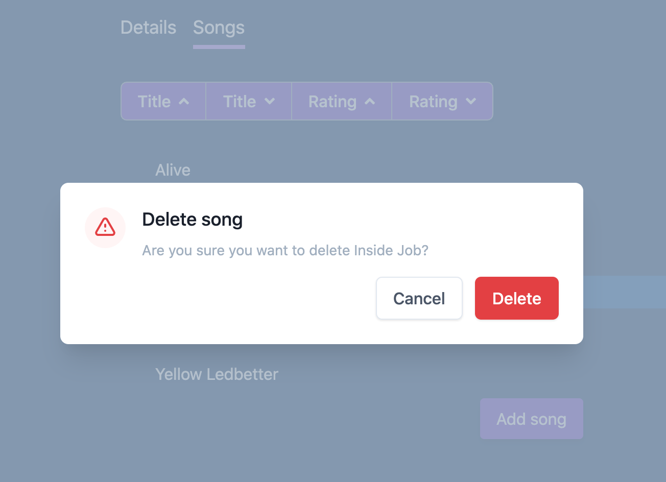
Now everything is in place: users can delete songs – or change their minds, and cancel.
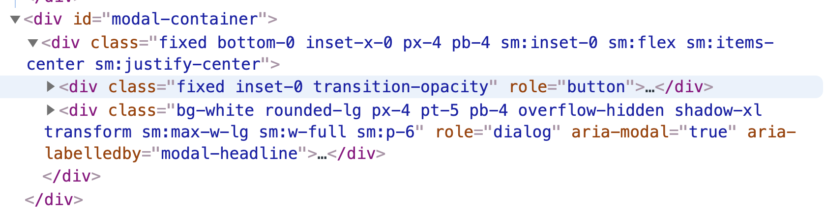
Right, so where is the in-element?
This works as it is but sometimes it's a good idea to render modal dialogs in a top-level container. This is where in-element helps us: it lets us render any template block totally elsewhere. The only parameter the helper takes is the DOM element where the block should be rendered.
Let's set this up now by first creating a modal container in the application template:
We should now use the in-element helper to render our modal dialog in the application template, in the space reserved for well-behaved modal dialogs:
We still have to define the modalContainer property as it needs to return a DOM element. Let's pop open the controller again to add it:
If you now bring up the modal dialog again and inspect the DOM tree, you'll find that it's now rendered within the container:
What else can in-element do?
The in-element helper can be handy every time you want to render something outside of the piece of UI (the template) where you carry out the operation, like flash messages, sidebars, or chat widgets.
Finally, a great add-on that provides a similar functionality but is more flexible is ember-elsewhere so I recommend you check it out if you find in-element too limiting.